Exorcise the Candy House
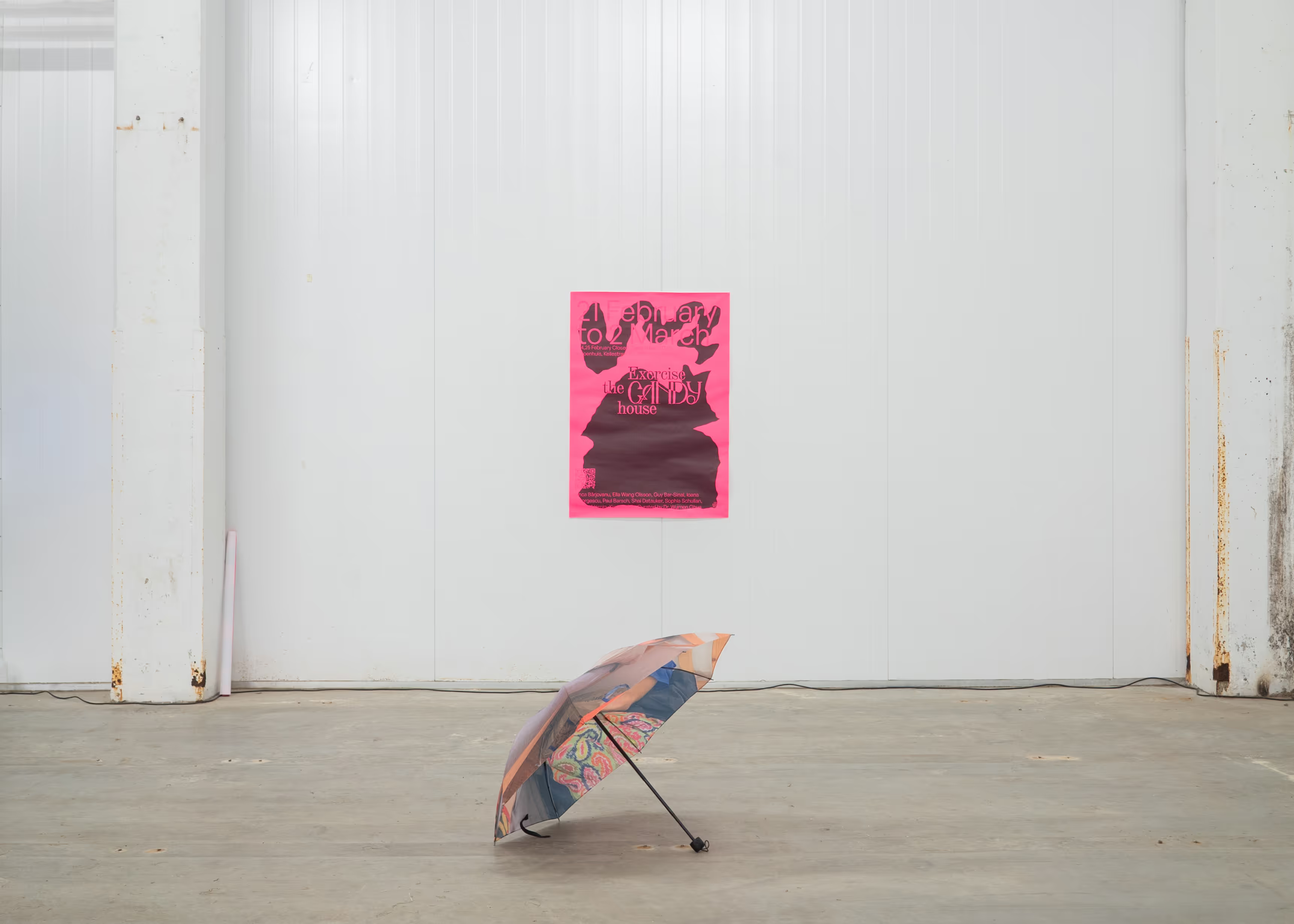
Installation view at Katoenhuis, showing a printed exhibition poster on a white industrial wall and an umbrella object in the gallery — referencing Paul Barsch and Tilman Hornig's umbrella works and the exhibition's symbolic scenography.
Group exhibition at Katoenhuis, Rotterdam — Design Biennale Rotterdam 2025
Exorcise the Candy House, curated by Dr. Wumen Ghua, ran as part of Design Biennale Rotterdam. The phrase "the candy house," as in the tale of Hansel and Gretel, symbolises the Faustian bargain of convenience and connection at the expense of privacy and autonomy. In the original story, the candy house — constructed by an evil witch — is designed to lure vulnerable children, exploiting their desperation and hunger.
The exhibition explores how humans, entangled in the hyperfold era, may find themselves "trapped" in a modern-day candy house of their own making. It poses a critical question: can we still purify and exorcise this haunted house of the digital age, or have we become the new witches lying in wait for lost prey?
Featuring works by Anca Bârjovanu, Ella Wang Olsson, Guy Bar-Sinai, Ioana Georgescu, Paul Barsch, Shai Datauker, Sophia Schullan, Tilman Hornig, and Xiaoyao Ma, Exorcise the Candy House examines the seductive allure and hidden dangers of the hyperfold. It invites viewers to reconsider the agency of the entities we create and inhabit, questioning whether redemption is possible — or even necessary — within a world of interconnected consciousness.
Hyperfold, surveillance, and design as exorcism
At its core, the exhibition disrupts conventional design paradigms, proposing that designed entities are not merely functional tools but contemplative instruments — portals for provoking progressive social design and reimagining digital spaces. It challenges us to confront the moral void of the hyperfold while envisioning a more compassionate path toward collective redemption. Rejecting purely functionalist perspectives, the show posits design as an act of exorcism.
Hyperfold (concept by Wumen Ghua): a state in which humans, IoT, AI, humanoids, minerals, and other agents — alongside data — are super-covalently folded into a collective being. This conscious entity operates with its own will, functioning within compressed and accelerated time.
Key questions at the heart of the exhibition include: Can we exorcise the ghosts of surveillance and algorithmic control? Could AI, instead of replicating hierarchies, become a catalyst for radical care? Can we redefine digital architecture as a space for admiration rather than extraction? Exorcise the Candy House challenges functionalist design paradigms, suggesting that digital systems are not merely tools but portals — offering opportunities to reimagine virtual space as a site of liberation rather than consumption.
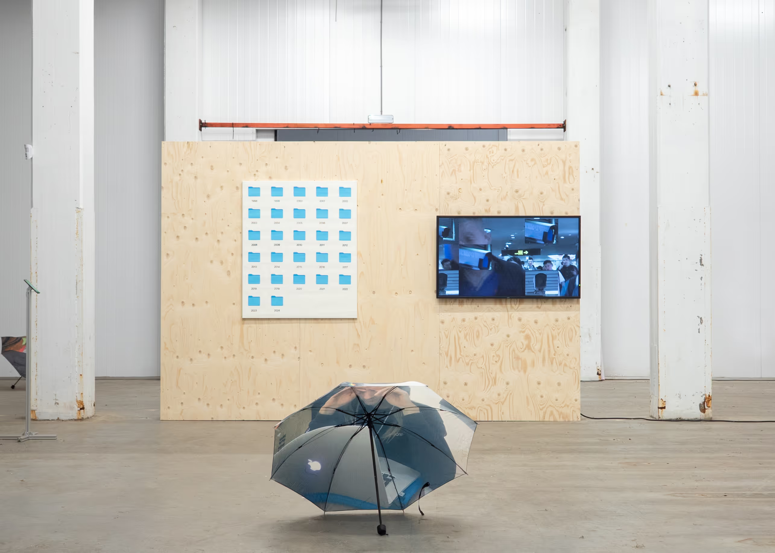
Visual identity, website, and catalogue by Webiii Studio
Webiii Studio created the exhibition's visual identity, printed catalogue, and an immersive Webflow website — treating the digital platform as part of the same symbolic world as the physical show. Visual design by Kirill Zakomoldin (Webiii) draws from Slavic mythology, folklore, and ritual visual languages: protective signs, folkloric shapes, and the visual grammar of spells, warnings, and thresholds. These references shaped a graphic system that feels both ancient and contemporary — bright pink symbols, distorted typographic forms, and soft photographic textures woven through print and screen.
The website serves as a digital extension of the exhibition at Katoenhuis. Visitors can explore the venue floor plan, view 360° imagery, and navigate to individual artist works and descriptions — connecting the on-site experience with the exhibition's curatorial narrative online. The catalogue, exhibition graphics, and digital materials carry the same identity across posters, signage, artist index, and communication.

Social & Digital
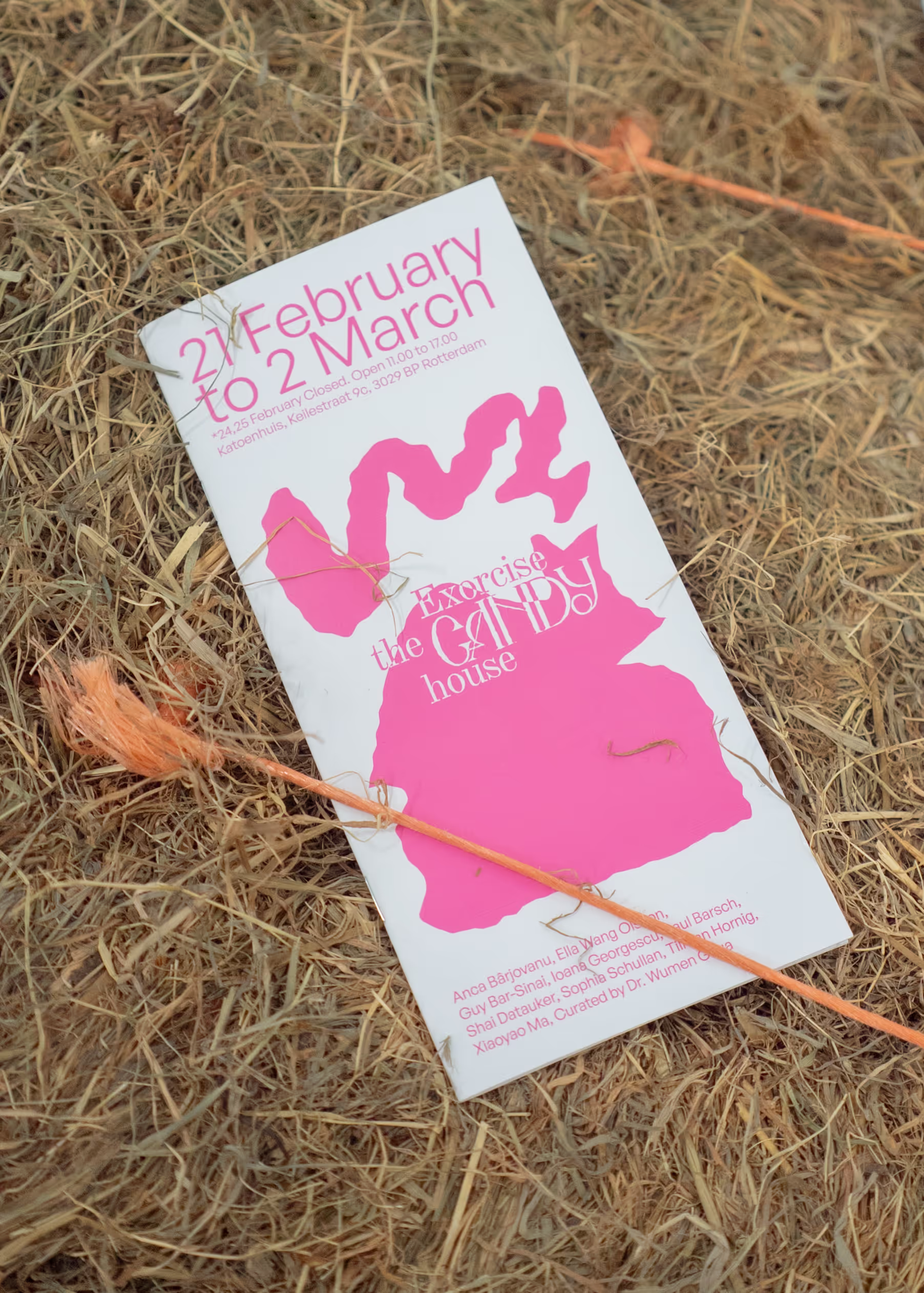
Main visual for Exorcise the Candy House, combining exhibition photography with the project's large symbolic white form, layered typography, artist names, venue information, and Design Biennale Rotterdam branding — a key identity asset across digital and print use.
Visual identity and graphic system for Exorcise the Candy House. Printed exhibition catalogue. Immersive Webflow website with floor plan navigation, 360° tour of Katoenhuis, and artist work pages. Exhibition graphics, posters, and digital communication materials. Identity extending across print, physical scenography, and the online platform — developed by Webiii Studio with passion and care.
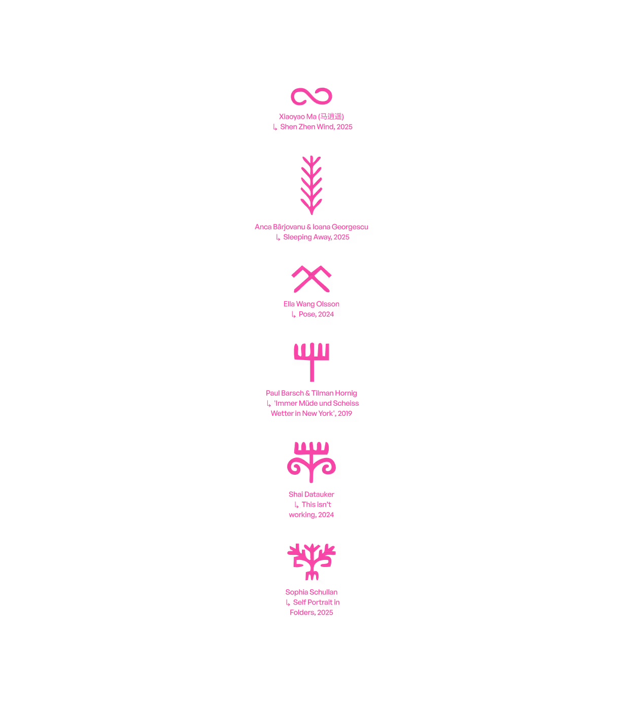
Graphic artist index from the identity system — each artist represented through a bright pink symbolic mark, referencing ritual signs, folklore, and protective visual languages inspired by Slavic mythology.
Anca Bârjovanu (RO), Paul Barsch (DE), Guy Bar-Sinai (IL), Shai Datauker (NL), Tilman Hornig (DE), Ioana Georgescu (RO), Sophia Schullan (DE), Ella Wang Olsson (SE/CN), and Xiaoyao Ma (CN). Curated by Dr. Wumen Ghua.

Photography: Olly Geary

