Pluk de Nacht — festival visual identity
Pluk de Nacht festival visual identity by Webiii Studio
Festival visual identity for an Amsterdam outdoor cinema event
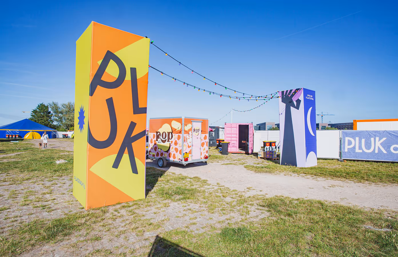
Webiii Studio created the festival visual identity for Pluk de Nacht, Amsterdam's outdoor cinema festival known for free outdoor screenings. The identity system began with a new logo, colour palette, typography and graphic language, then expanded across three editions through ABRI poster campaigns, motion graphics, social media formats, merchandise and festival screens.
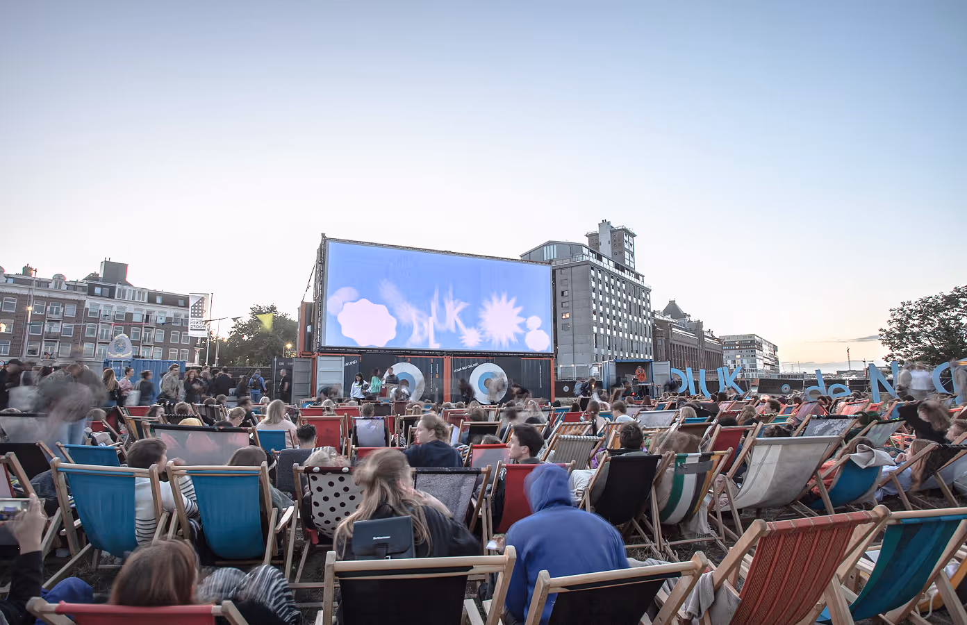
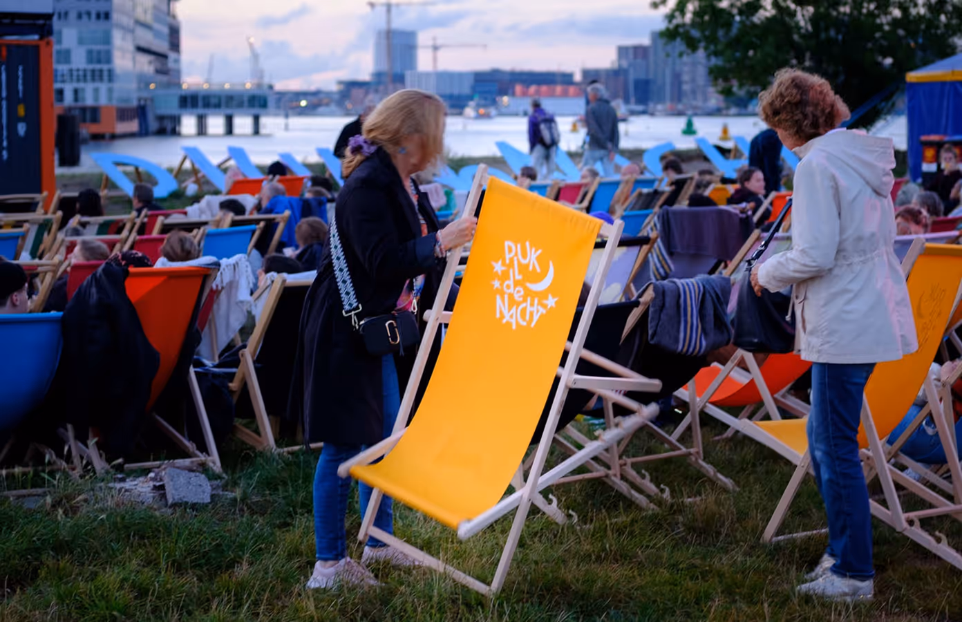
Pluk de Nacht is one of Amsterdam's best-known summer traditions — outdoor cinema by the water, films under the open sky, and thousands of people gathering around cinema, summer and the city. Webiii Studio developed a visual system to match that atmosphere: unpretentious but sharp, warm, direct and visible from the street.
By 2024, the identity had grown into a recognisable presence across the city, without needing to start over each year.
Poster campaigns and graphic language for the city
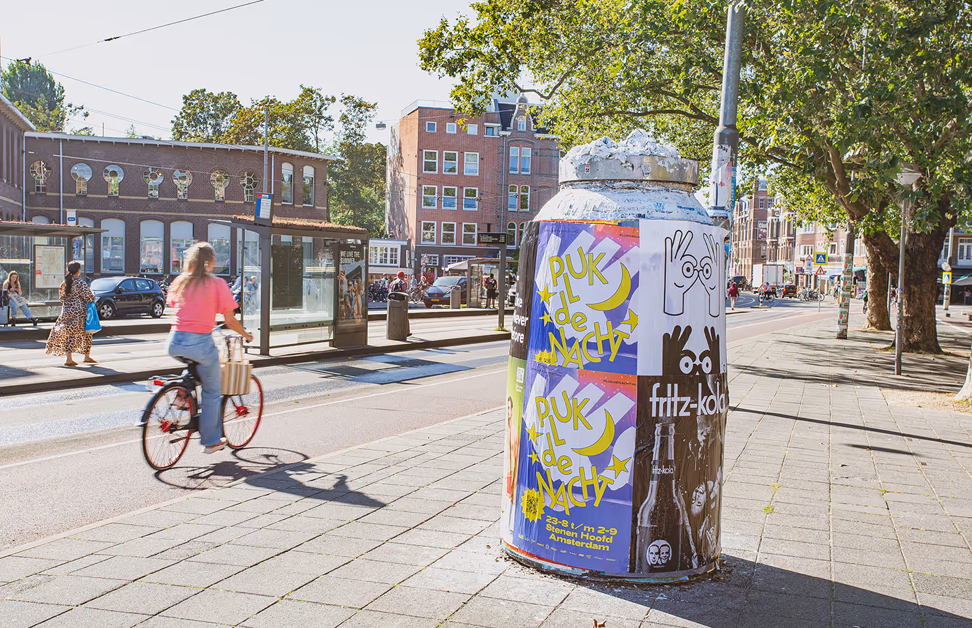
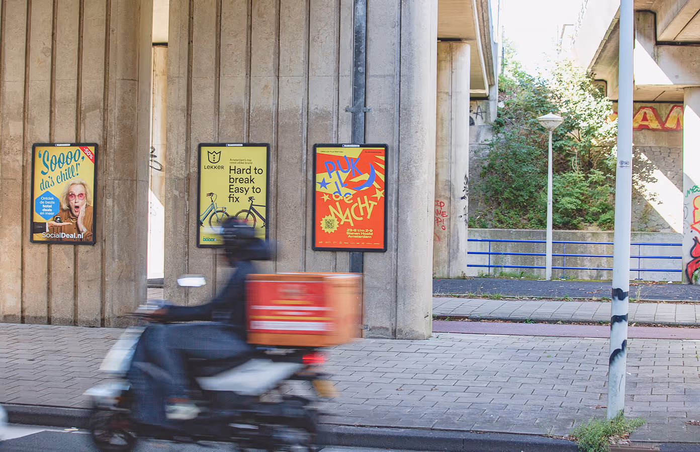
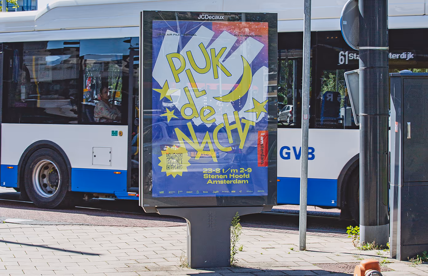
The visual language draws from comics, retro-futurism and the sharp economy of classic film-title graphics — with a nod to Saul Bass — using bold silhouettes, high contrast, expressive typography and colours that hold up after dark. It was designed to work quickly: readable from a moving bike, strong on a street poster, and still alive on a phone screen.
The first ABRI poster campaign appeared across Amsterdam in 2022 and set the tone for the editions that followed. Print was the foundation, but the system was built to move naturally between outdoor media, digital formats, festival screens and merchandise.
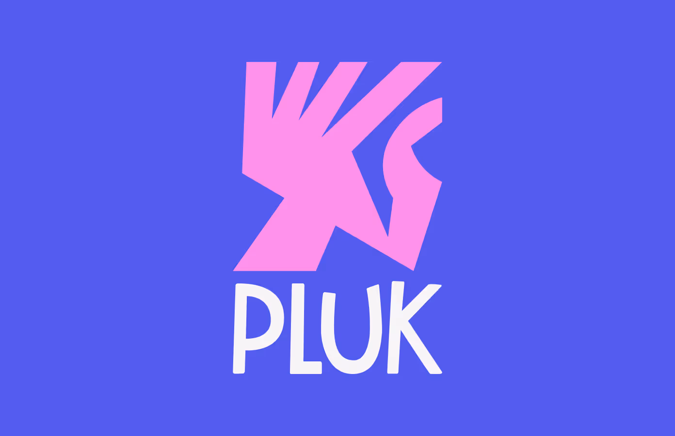
Festival branding system with logo, typography and colour palette by Webiii Studio
A reusable identity system across three editions
Each edition became an expansion rather than a redesign. The core identity stayed recognisable, while new posters, formats, animations and campaign assets pushed the language further. By 2024, the system had developed its own rhythm within Amsterdam's summer cultural calendar.
Social & Digital
During the festival, the identity continues on screen — motion graphics, projection visuals and guidelines for the streaming layer. These are the details most visitors may not consciously name, but would immediately miss if they disappeared.
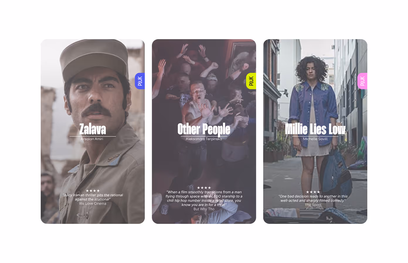
The same language extends across Instagram, Facebook and Google Ads, with more than twelve digital formats designed to feel like part of the festival identity rather than generic social templates. Same energy, adapted for the scroll.
This identity case is part of Webiii Studio's work for cultural events and festivals. The companion Pluk de Nacht website case covers the digital platform, programme structure, reservation flow and custom front-end development. Together, the two projects show how Webiii Studio connects festival branding, campaign design and digital infrastructure into one coherent event system.
Relevant for cultural organisations looking for festival identity systems, poster campaigns, motion graphics, social formats and digital platforms that can grow across multiple editions.
Identity system and logo. Colour palette and typography. Annual poster campaigns across three editions, including ABRI and additional print formats. Social and paid media assets for Instagram, Facebook and Google Ads. Motion graphics and screen visuals for the festival. Brand guidelines. Merchandise including t-shirts and stickers.
Photography: Veerle Snijders, Erwin Verbruggen, Davy Maengkom, Angie Houben.
